
Table of Contents
- How to Style Pop Culture Posters in a Small Apartment for a Curated Look
- Best Framing Techniques for Posters That Elevate Your Space
- Gallery Wall Layout Ideas for Small Spaces
- How to Arrange Art in a Small Apartment Without Overwhelming the Space
- Selecting Pop Culture Art That Works Together
- Rental-Friendly Hanging Solutions for Pop Culture Posters
- Lighting and Accessories to Complete Your Curated Art Space
- Frequently Asked Questions
Last Updated: August 29, 2026
How to Style Pop Culture Posters in a Small Apartment for a Curated Look
Styling pop culture posters in a small apartment means treating your space with the intentionality of a gallery curator. When done right, pop culture posters become the foundation of a thoughtful, personal art space that feels sophisticated rather than cramped.
According to research from ReportLinker’s Canada Wall Art Market analysis, the wall art market in Canada generated USD 930.4 million in 2025 and is expected to reach USD 1,275.7 million by 2033, growing at a compound annual growth rate of 4.2% Canada Wall Art Market Analysis. This reflects a broader shift: homeowners are investing more intentionally in wall decor that expresses their identity.
At McMullon Brands, we understand that small apartments present unique challenges: limited wall space, rental restrictions, and budget constraints. But these constraints force you to be selective, intentional, and creative, resulting in a space that feels genuinely curated rather than randomly assembled.
Below, we’ll walk you through proven strategies for styling pop culture posters in a small apartment. You’ll learn how to select frames that elevate your pieces, arrange them for visual impact, and use lighting and accessories to complete your curated art space.
Best Framing Techniques for Posters That Elevate Your Space
Framing is where casual poster displays become curated art spaces. The right frame transforms a print into a finished piece; the wrong one can cheapen even high-quality artwork. In small spaces, consistency matters more than in larger rooms, your eye processes everything at once, so visual harmony prevents chaos.
Choosing Frame Styles and Materials
Metal frames work exceptionally well for modern pop culture aesthetics. Black metal frames create clean lines and feel contemporary; gold or brass frames add warmth without heaviness. Metal frames take up minimal visual weight, critical in compact spaces.
Wood frames suit vintage, retro, or mid-century pop culture references. Light wood tones align with the warm minimalism trend Canadian homeowners are embracing in 2026. Darker wood frames ground bolder, more saturated poster designs.
Matte finishes prevent glare and create a gallery-like quality. Glossy frames reflect light in ways that make small spaces feel busier.
Frame width should scale with poster size. A 60 cm x 90 cm poster benefits from at least a 3.8-centimetre border; smaller 45 cm x 60 cm pieces look proportional with 2.5-centimetre frames.
Budget-Conscious Framing Hacks
Floating frames are affordable alternatives to traditional framing, costing 40-60% less while delivering a premium appearance.
Batch ordering reduces per-frame costs significantly. Volume discounts apply, and you’ll achieve visual consistency across your gallery wall.
DIY mat cutting saves money if you’re comfortable with basic tools. Pre-made frames with adjustable mat openings let you customize the mat size without paying labour costs.
Many retailers offer free shipping on bulk frame orders. Ordering five frames at once often qualifies for free delivery, saving $25-$50 depending on your location.
Gallery Wall Layout Ideas for Small Spaces
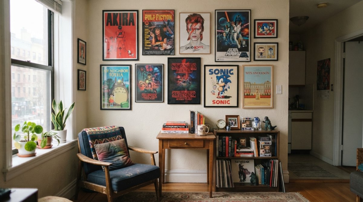
A gallery wall is the cornerstone of a curated pop culture art space. In small apartments, the goal is visual interest without chaos, a carefully composed collection that feels intentional rather than overcrowded.
The Eclectic Collector Approach
The 2026 trend moves away from perfectly symmetrical, identical-frame arrangements. The “eclectic collector” vibe works better in small spaces because it creates rhythm and prevents monotony.
Start by selecting 5-7 pieces that share a common thread: all pop culture, all from a specific genre, or all featuring a consistent color palette. Lay pieces on the floor first, arranging them in a loose grid with 5-10 centimetres between frames. Take a photo from above to reference during hanging.
When mixing frame styles, establish a visual anchor: perhaps 70% of frames are black metal, with 30% in natural wood or gold. This ratio prevents the wall from feeling too busy while allowing personality to shine through.

Fewer, Larger Pieces for Visual Calm
A practical shift in 2026 is moving towards fewer, larger pieces of wall art. Instead of filling a wall with many small frames, choosing one oversized poster to anchor the entire space often creates a calmer feeling.
A single 60 cm x 90 cm poster behind a sofa or bed serves as a focal point that makes the room feel intentionally designed. If you want multiple pieces without visual chaos, use the “1+2” formula: one large statement piece paired with two smaller complementary pieces positioned nearby but not adjacent.
Fewer, larger pieces create a sense of intentionality. Small apartments benefit more from this restraint than from gallery walls packed with dozens of frames.
How to Arrange Art in a Small Apartment Without Overwhelming the Space
Arrangement strategy determines whether your pop culture posters feel curated or cluttered. The difference comes down to proportional balance, eye-level placement, and strategic use of vertical space.
Maximizing Vertical Space
Small apartments force you to think vertically. Identify your longest uninterrupted wall and plan your arrangement to use at least 70% of that height. This creates energy without consuming floor space.
Position your largest piece at eye level (approximately 145-152 centimetres from the floor to the center of the frame). Smaller pieces can float above or below this anchor point, creating vertical flow that guides the viewer’s eye.
For rental apartments, adhesive hanging strips rated for picture frames offer a rental-friendly solution that holds securely without damaging walls.

Proportional Balance and Eye-Level Placement
The total area of your wall art should occupy no more than 40-50% of the wall it’s displayed on. This preserves negative space, essential for making compact apartments feel open.
Eye-level placement is non-negotiable. For most people, this is 145-152 centimetres from the floor to the center of a frame. Position your largest or most important piece at this height.
If hanging art above furniture, maintain 20-30 centimetres of space between the top of the furniture and the bottom of your frames. This creates visual separation and prevents the art from feeling like it’s pressing down on the space below.
Curvilinear furniture and rounded edges break up straight lines and sharp corners, adding visual interest. If your pop culture posters feature bold geometric designs, balance them with curved elements elsewhere in the room.
Selecting Pop Culture Art That Works Together
Strategic curation means selecting pieces that complement each other while expressing your personality. This is where “posters on a wall” becomes “a curated art space.”
Building Thematic Cohesion Across Different Genres
Thematic cohesion doesn’t require matching aesthetics. Instead, identify a unifying principle that connects disparate pieces.
Common unifying threads include:
- Colour palette: All pieces feature warm tones, cool tones, or a specific dominant colour
- Era: All pieces reference the same decade or cultural moment
- Medium or style: All pieces use similar artistic techniques
- Genre: All pieces reference the same medium (film, music, television, literature)
- Mood or message: All pieces evoke a similar emotional response
Once you’ve identified your unifying principle, use it to evaluate new pieces. In small spaces, every piece should earn its place.
Color Palette and Visual Weight Considerations
Color is the fastest way to make a small space feel cohesive or chaotic. Warm minimalism, the dominant Canadian design trend for 2026, pairs neutral wall colours with warm accent tones. If your apartment walls are soft white, cream, or warm grey, pop culture posters with warm colour palettes integrate seamlessly.
Visual weight refers to how much visual presence a piece has. A dark, heavily saturated poster carries more visual weight than a light, pastel one. Balance visual weight by alternating heavy and light pieces.
High-contrast posters draw the eye intensely. Use these strategically as focal points rather than filling your entire gallery wall with them.
Avoid placing multiple high-contrast, heavily saturated posters adjacent to each other in small spaces. Space them out and balance them with lighter or more neutral pieces.
Rental-Friendly Hanging Solutions for Pop Culture Posters
Renting eliminates permanent wall modifications, but rental-friendly solutions have evolved significantly.
Adhesive hanging strips designed for picture frames hold surprisingly well. Products rated for 2-4.5 kilograms per strip can support most framed posters. Use enough strips (typically 2-4 per frame) and allow the adhesive to cure fully.
Damage-free picture hangers use a hook-and-nail system that leaves only a small nail hole, typically covered by the frame when removed.
Command strips and similar products use removable adhesive that won’t damage paint or drywall. Follow application instructions precisely and remove slowly at a 45-degree angle.
Leaning or propped arrangements work for smaller pieces without any wall modifications.
Before committing to any hanging method, test it on a small, inconspicuous area first.
Lighting and Accessories to Complete Your Curated Art Space
Lighting transforms how your pop culture posters are perceived. Directional lighting draws attention to specific pieces. A small track light or adjustable wall-mounted lamp positioned above or beside your focal point highlights it and creates visual hierarchy. Warm-toned LED bulbs (2700K-3000K) complement most pop culture aesthetics.
Ambient lighting prevents your art from looking isolated. Soft background light from lamps, string lights, or ceiling fixtures creates an inviting atmosphere.
Shelving adjacent to your gallery wall extends your curated aesthetic. Display small collectibles, books, or decorative objects that complement your pop culture theme.
Mirrors positioned near your art reflect light and create the illusion of more space.
Plants and natural materials align with the biophilic design trend gaining traction in 2026. A trailing plant above a gallery wall or potted greenery at its base softens hard edges and adds warmth.
Pop culture enthusiasts on a budget who want a curated aesthetic without professional design services. These techniques require only basic tools and strategic thinking.
Small apartments don’t require you to compromise on aesthetic sophistication. Pop culture posters, when styled with intention, become the foundation of a genuinely curated art space. The constraint of limited square footage forces the selectivity that separates thoughtful collections from cluttered displays.
McMullon Brands creates pop culture posters and art prints designed for exactly this purpose, distinctive, high-quality pieces that work as part of a cohesive collection. With our free shipping on all orders and made-to-order production, you can curate your space affordably without settling for mass-produced alternatives. Start with one statement piece, build intentionally, and watch your apartment transform into the gallery-worthy space you’ve envisioned.
Frequently Asked Questions
What is the best way to hang pop culture posters in a small apartment without damaging walls?
Use damage-free hanging solutions like adhesive strips, poster putty, or magnetic strips, ideal for rentals. For a more permanent solution, small picture hooks with minimal wall impact work well. Ensure your mounting hardware matches the poster’s weight. Rental-friendly options let you style pop culture posters without losing your security deposit, and many come with easy removal instructions.
How do I create a cohesive gallery wall with different pop culture themes?
Focus on a consistent color palette or frame style to unify diverse themes. Mix frame sizes and orientations for visual interest while keeping the overall composition balanced. The eclectic collector approach, mixing sizes, genres, and frame styles, creates walls that appear gathered over time rather than mass-produced. Ensure pieces relate through color, mood, or era to maintain thematic cohesion across your curated art space.
How many pop culture posters should I display in a small apartment?
Fewer, larger pieces create a calmer feeling than many small frames. A 2026 design trend shows that one oversized poster (45-60 centimetres) anchors a space effectively without overwhelming it. For gallery walls, start with 5-7 pieces and adjust based on wall size. Quality over quantity prevents visual clutter and lets each pop culture poster breathe, maintaining the curated art space aesthetic.
What framing techniques make pop culture posters look more sophisticated?
Invest in quality frames that complement your décor rather than cheap plastic options. Mat boards add depth and professionalism, creating visual separation between poster and frame. Mixing frame materials and finishes, wood, metal, or painted frames, elevates the look. Budget-conscious alternatives include thrift store frames refinished with paint, or frameless options with acrylic or plexiglass. Professional framing techniques transform casual posters into gallery-worthy pieces.
This article was written using GrandRanker